Just to be clear, I was the captive in this scenario.
My girlfriend wanted to buy some stuff on Patagonia.com because they were having a discount event. Since she is from Brazil and her computer was not allowed access to this discount event, I have no choice but to do a screen share with her while she uses me as a robot to do her shopping on Patagonia.com. Failure to do so will very likely result in domestic violence of some form or another on the captive, in this case – me…
Fortunately enough, it was not a thorough time waste, I was able to glen a bunch of very useful insight during this 1.5 hours shopping experience we conducted online.
Profile of Subject:
- 47 years old
- Tertiary level Educator for MBA students
- Low to mid level of tech savviness
Way usability test was conducted:
Captive only performs an action when shopper tells captive to do so. Otherwise captive does nothing but observe eye movement of shopper. Occasionally captive would ask probing question about what is going on in the mind of the shopper when shopper is presented with visual stimulus or when she looks confused.
Observations during the entire 1.5 hours of shopping experience where I was the robot:
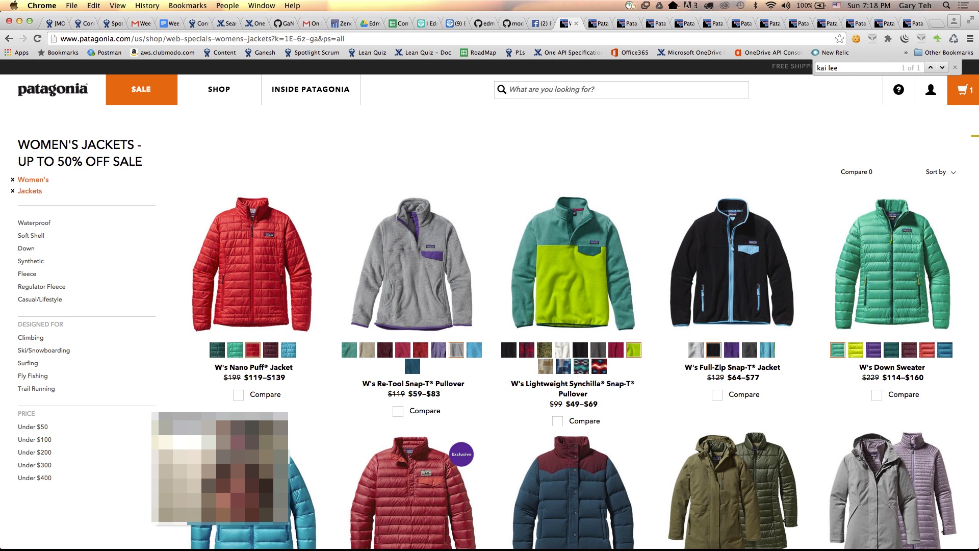
Listing section experience
- Browsing of listing is an extremely important experience
- User browse listings from left to right and top to bottom initially
- User has this tendency to go and up multiple times on the same listing to ensure she does not miss out on items that might be of interest to her
- Ability to search and retrieve only items with Discount when discount is happening is very important
- Pagination must be very prominent – ideally user should not even have to click to navigate across pages
- User specific behavior traits that we should explore more test subjects to observe generalized trends.
- Colors of clothing –
- large item color should not be too bright
- small item color can have brighter color
- Colors of clothing –
- Filtering needs to work very well – resultant listings with mixed item types are very annoying
- Close proximity of items with similar attributes is very important
- It is very bad experience when when paka and non-paka types are listed side by side
- Same jacket with hoodie/without hoodie should be in close proximity in listing
- Inferred hierarchy of attributes seems to be critical
- Conformity of visual pattern across all listed product is important. Confusion will ensure otherwise
- If all products have grid icon beneath their main thumbnails to display available colors any product that only has one color should also show the same grids even if it only has one color available
- Ability to filter base on presence or absence of an important attribute is very important
- E.g. Paka hoodie/no hoodie
- It is important to be able to identify up front the kind of attributes shoppers will perform item filtering on and make them easily available to her during her shopping experience
- Allowing users the ability to bookmark an item during a shopping session for later reference during that same shopping session is very important.
- This effect can be best achieved with product detail page opening up in a different tab.
- Funky feature that is built into the site is detrimental to actual experience and will only serve to confuse user
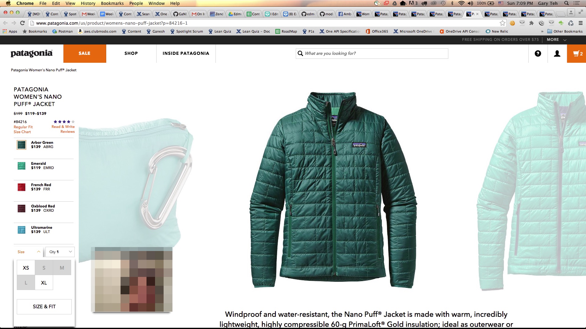
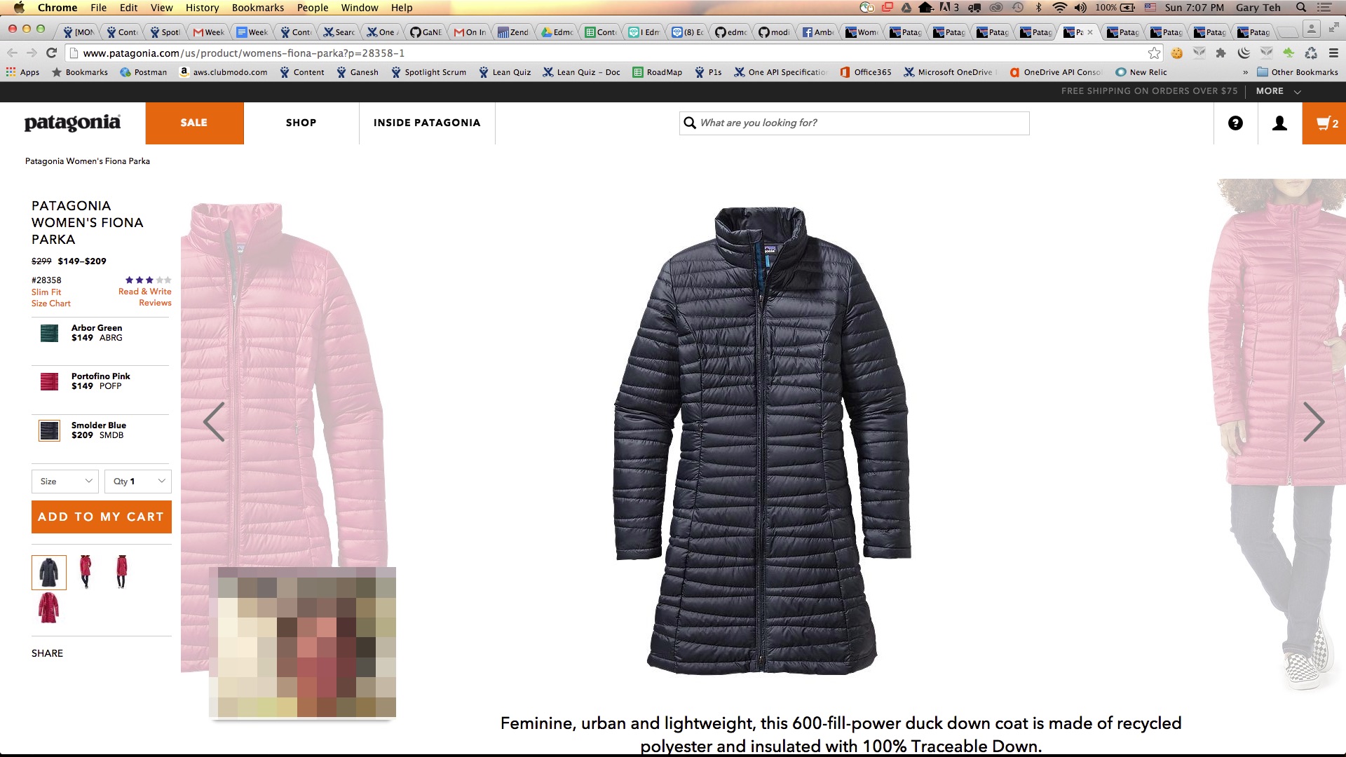
Product detailed page section
- Immediate visibility of availability when user is in product detail view is very important
- It is extremely bad user experience to make availability information visible only after user clicks on item 2 times
- Price should be listed clearly beside sub-item variant
- Items at lower left section of page are missed by shopper until captive prompts shopper of its existence
- Thereafter shopper browses through each of the image variants to get a feel of how clothing article might look on her
- It is important to relate how article would be relevant to her in her natural environment
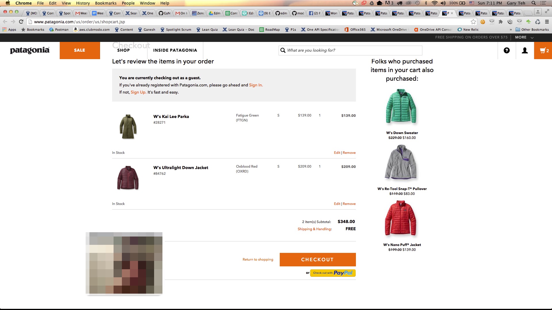
Payment funnel section
- User has tendency to go back to browsing listings even during a checkout process.
- Timeout and losing of shopping cart information is going to be very very bad
- Showing of a button to create account after checkout with irrelevant UVP is pointless
- Showing of related products without first figuring what attributes are important for user is pointless